
Which style will you use for your quote and which will you use for the author's name.
Alignment
The Impact of sizeI’ve created tons of printed promotional ads in the six years that I’ve been a designer. One of the things that you learn very early working with promotional materials is that headlines should grab the reader instantly. You’ve got a second or two at best to get someone’s attention in the print world. If you miss that opportunity, you’ve lost your potential customer. What this means practically is that when you’re creating a headline, don’t simply type it out: design it. Consider the following two examples: 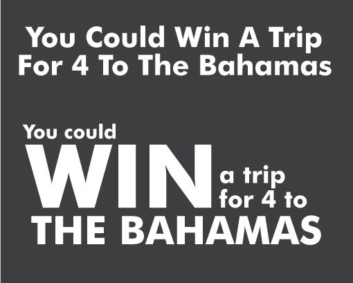
|