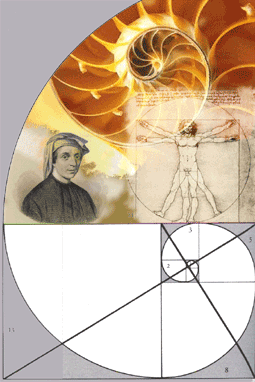
Grid System

A brochure that unfolds and refolds in the hand is intrinsically different from a formal letter that lies motionless and flat.

Robert Bringhust, The Elements of Typographical Style

Introduction
A page, like a book or a room, can be of any size and proportion, but some are distinctly, more pleasant than others. Designs for projects such as books, brochures, magazines, newspapers have certain elements in common: columns for text, areas for illustrations and photographs, headlines, page numbers and margins. To successfully juggle all this information, designers often create an underlying set of placement guidelines, called a grid. Although in the final product, the grid lines are invisible, their effect upon a design is not: Girds are essential in creating visual consistency in projects that move across multiple pages and panels.

Project
Design a flyer, using an underlying grid system. The grid system needs to be proportional to the visual elements and the page size as well as consistent across each panel.

Focus
Your Flyer is a visual exploration on a word theme. First, you need to choose a word and then look-up four synonyms for it. Next, using an underling grid system, create a layout for your word, using images, text and placement to convey and express the meaning of the word.

Word Topic

Frist, print out the form: Word Topic

Next, choose two different two words which you could use for the theme of this project.

Then, go to the online thesaurs and choose from one of the definitions four Synonyms to the word. Thesaursu.com

Next, complete the Word Topic form and then turn it in.


FLYER

  • Illustrator
  • Image Resolution: 150
  • Portrait:4 in x 6in
    or Landscape: 6 in x 4in


Golden Section
The golden section is a symmetrical relation built from asymmetrical parts. In the world of pure mathematics, this spiral of increase, the Fibonacci series, proceeds without end. Fibonacci series and the proportions can be seen in the structure of pineapples, pinecones, sunflowers, sea urchins, snails, the chambered nautilus, and in the proportions of the human body as well. The golden section was much admired by classical Greek geometers and architects, and by the Renaissance mathematicians, architects and scribes, who often used it in their work. It has also been much admired by artists and craftsmen, including typographers, in the modern age.

Grid Pointers

Reverse Engineering
Reverses engineer a grid of a magazine or other publication you admire. Remember the steps you performed to create your Paul Rand layout.

Internal Grid
Start with one element and let the grid develop form there. For example, the headline type will provide a left and right vertical grid lines as well a horizontal guide. Use one or more of those guides to place additional elements until another grid line is necessary. Then use one of the new elements to indicate where to place a new grid line.

Extrapolating
If you have the talent to prepare one interesting layout, but cannot quite imagine how to expand it into a grid, first work on one layout. Then analyze it for its placement of basic elements so you can then extrapolate the basic grid system underling the layout. Next apply that basic grid to your second layout.


Envelope (Not Assigned)


The design for the envelope focuses on the original word you choose for this project. You will create a design and layout for the envelope, using images from your brochure as well as referencing elements of your grid system in your layout.